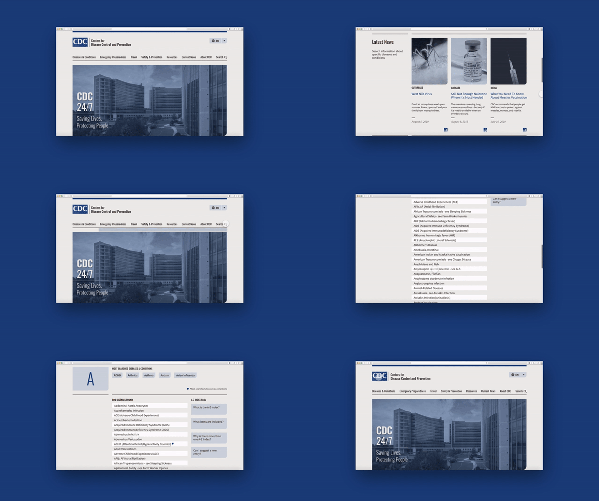
There’s a lot of information and data that the CDC website is trying and needs to convey. Although the information
was categorized, it was hard to easily recognize them and navigate through to find what is needed.
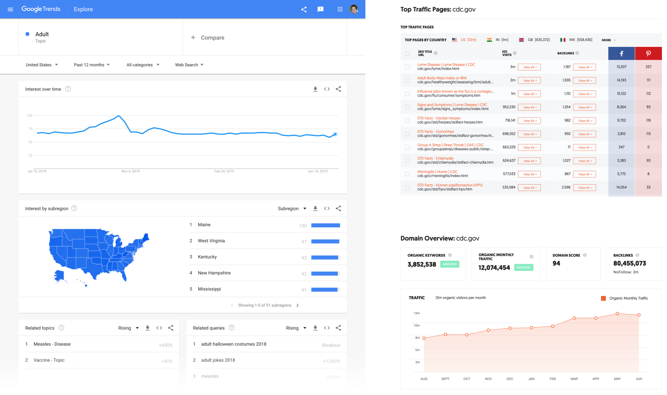
We tried to define the wireflow by searching the trends and top traffic pages with the CDC website in order to see
what people most seek when coming to their website.
Why users go to CDC website
Fact Pages about Diseases (Lyme, Influenze, Strep Throat, Meningitis…)
BMI Index (Adult and Children)
STD Facts and Disease Facts
Disease Fact Pages
Topical / Current Events
Natural Disasters / Emergency Preparedness
Prevention
Linked from Other Sites
Top Keywords that link back to CDC
Chalmydia
Flu Symptoms
Strep Throat
Flu Symptoms
Calculating BMI
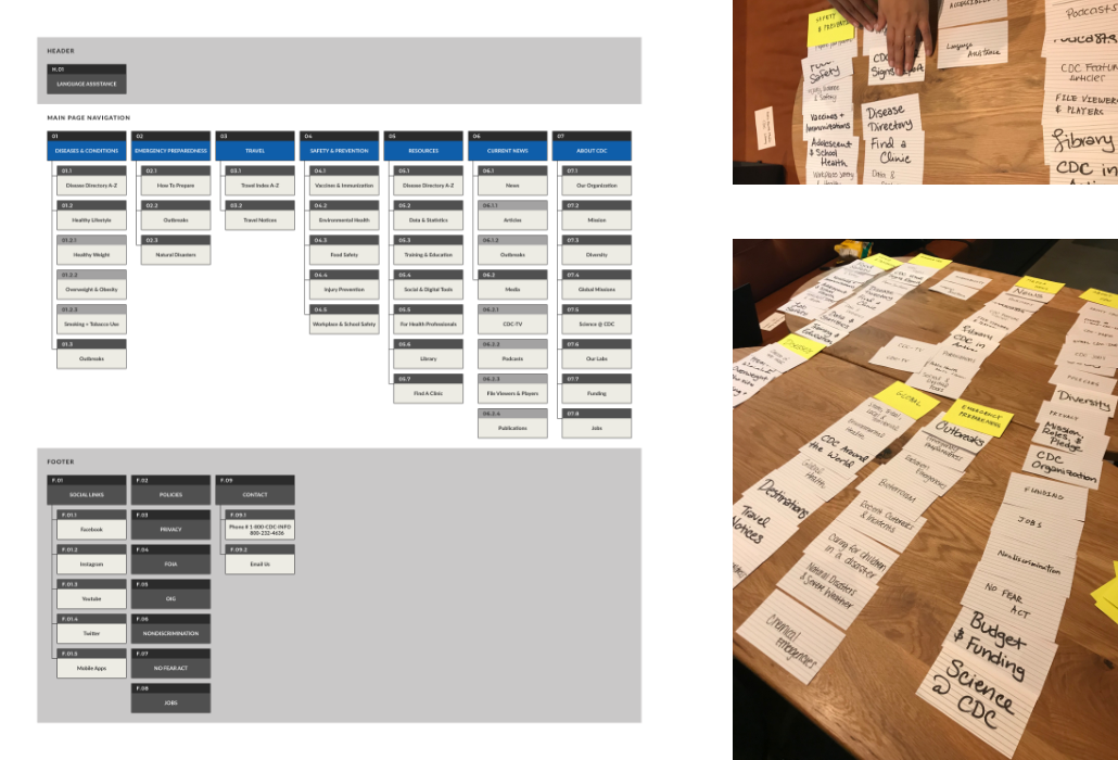
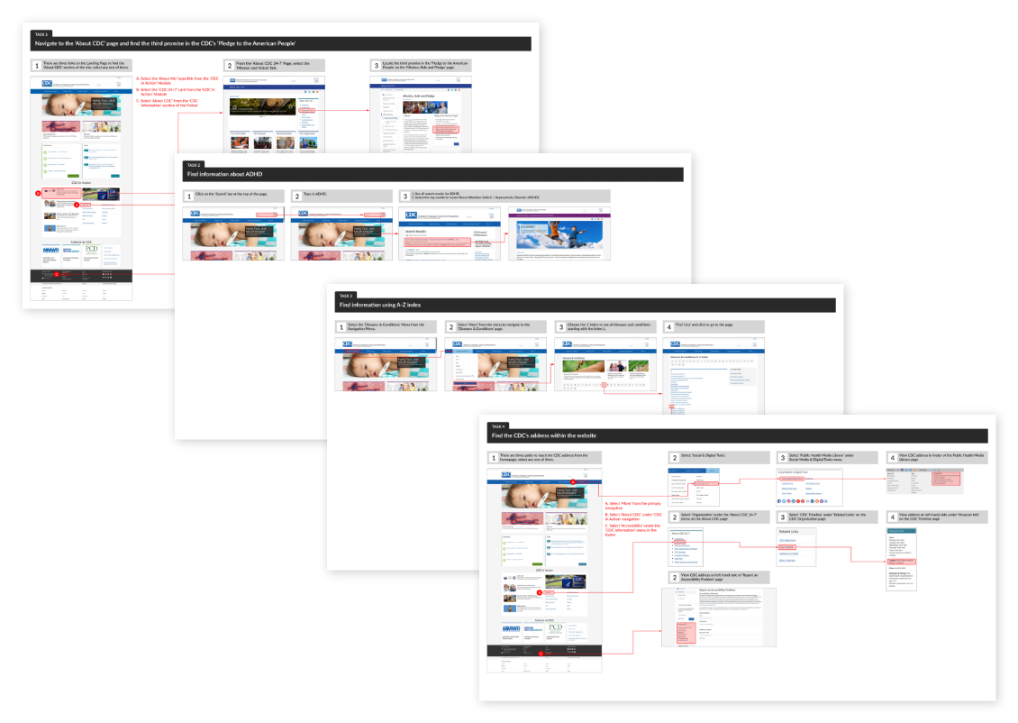
With given tasks to the users, we created a wireflow mapping the current user flow.
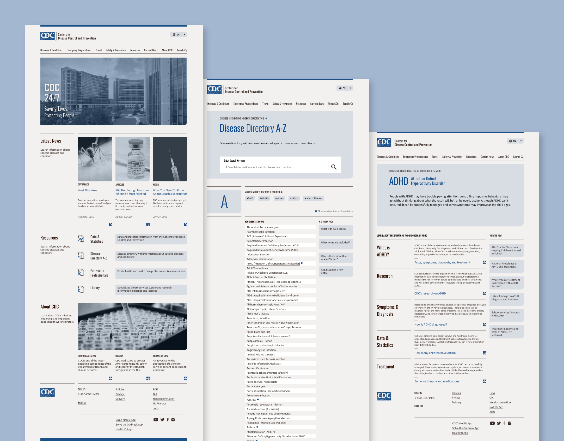
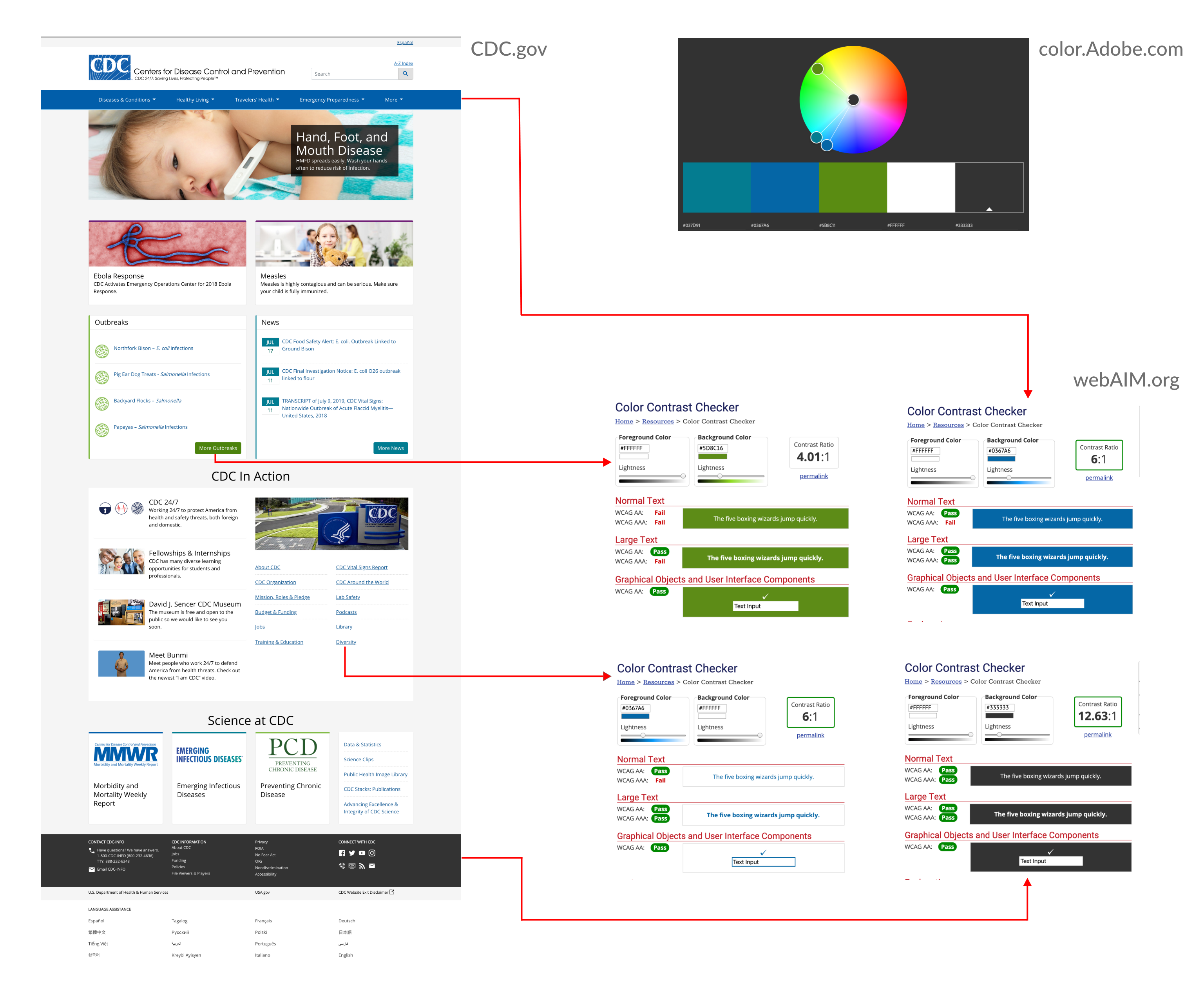
The heuristic analysis showed the need for both internal informational architecture and UI. Restructuring the
information hierarchy and having a well-organized look will reduce a significant amount of confusion.
The color accessibility check was needed. Most color contrasts passed except certain shades, such as green.
Because of various information services and abundant information resources, smaller texts needed to contrast
with
the
background so that the contents could be clear and easily read. Paying careful attention to the suitable use
of
negative space can support the visual hierarchy.
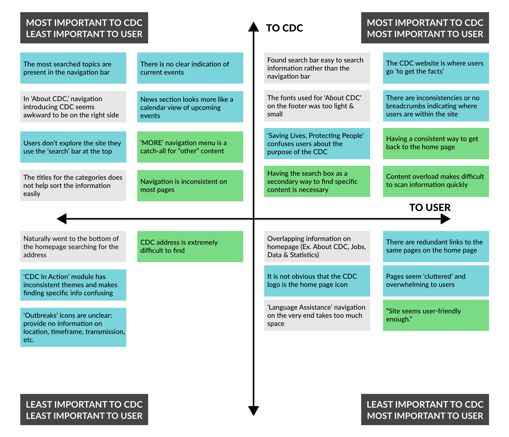
With the evaluation, we listed the important features and categorized them in a prioritization matrix.


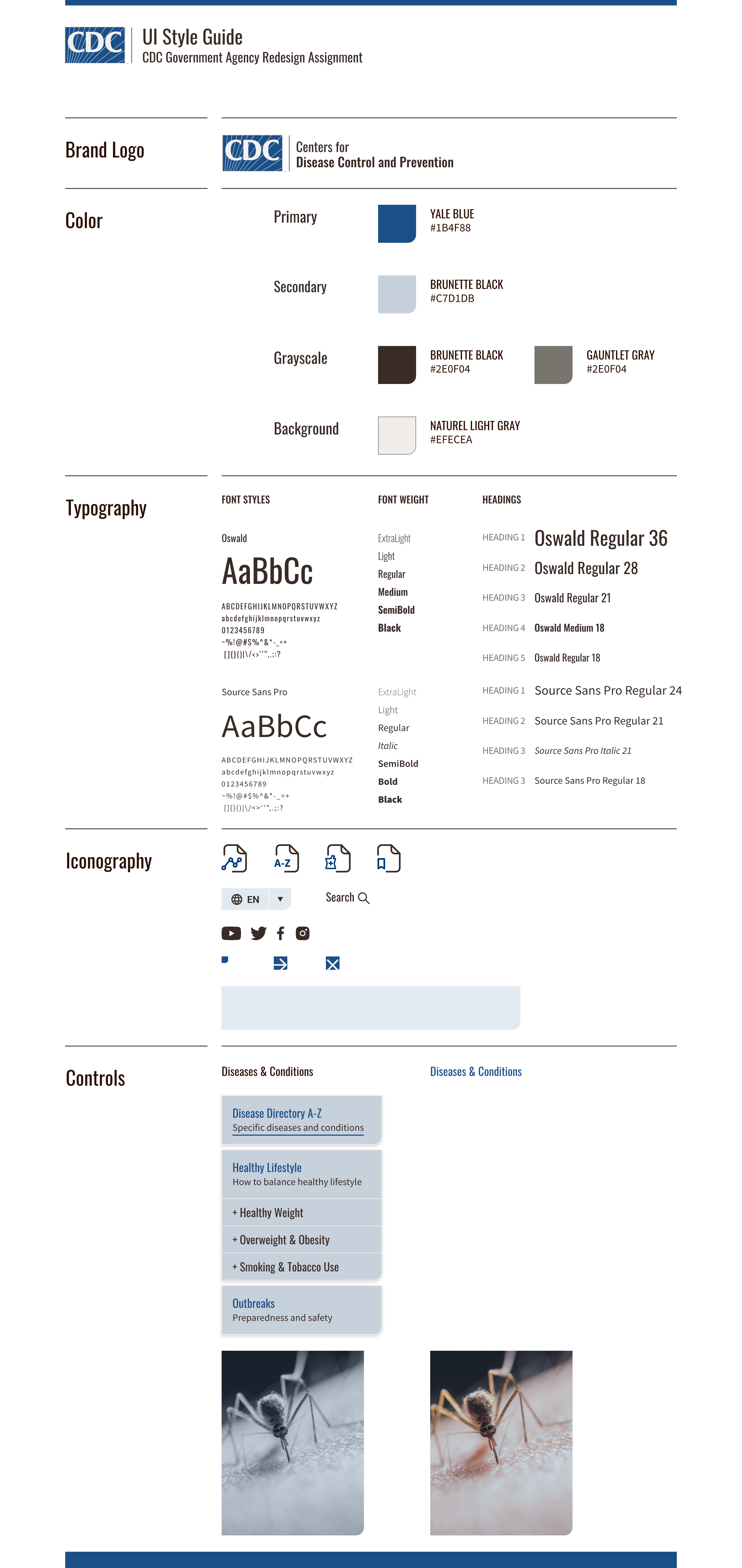
Consistency, Clarity, and Unity
These were the main concerns when building the style guide. All the elements
specified
in the Style Tile must easily guide the user to what they’re searching for.


 We tried to define the wireflow by searching the trends and top traffic pages with the CDC website in order to see
what people most seek when coming to their website.

 With the evaluation, we listed the important features and categorized them in a prioritization matrix.
